Understanding Bar Charts: A Comprehensive Guide
Bar charts are a fundamental tool in data visualization, providing a simple and effective way to present and compare data across different categories. Whether you’re analyzing business performance, academic results, or any other type of data, bar can help you communicate your findings clearly and effectively. In this article, we’ll dive into the details of charts, exploring their components, types, applications, and tips for creating them. Let’s get started.

What is a Bar Chart?
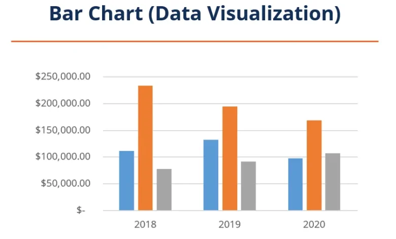
A bar chart is a graphical representation of data using rectangular bars. The length or height of each bar is proportional to the value it represents. Bar are used to compare different categories of data, making it easy to see which category is the largest or smallest.
Bar charts come in two main orientations: vertical and horizontal. The bars extend upwards from the horizontal axis in a vertical bar , also known as a column chart. The bars extend outwards from the vertical axis in a horizontal bar chart. The choice between vertical and horizontal depends on the nature of the data and the ease of readability.
The beauty of bar charts lies in their simplicity. Even someone with no background in data analysis can quickly grasp the key insights just by glancing at the chart. This ease of understanding makes bar popular in reports, presentations, and dashboards across various fields.
Types of Bar Charts
Bar charts come in several variations, each serving different purposes and providing unique insights. Understanding these variations can help you choose the right type of bar for your data.
- Simple Bar Chart
A simple chart is the most basic form, where each bar represents a single data category. This type is perfect for straightforward comparisons, such as comparing the sales figures of different products.
Simple bar charts are easy to create and interpret. They are ideal when you have a limited number of categories and a clear, direct comparison. However, they might be less effective for complex datasets with multiple variables.
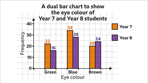
- Grouped Bar Chart
Grouped bar , or clustered bar charts, are used when comparing sub-categories within each main category. In this type, multiple bars are grouped for each main category, representing a sub-category.
For instance, if you compare sales figures across different regions and further break them down by product types, a grouped chart will show the sales of each product type within each region side by side. This helps in understanding the distribution and performance across multiple dimensions.
- Stacked Bar Chart
Stacked charts take grouping a step further by stacking sub-category bars on top of each other within the main category. This type helps show the main category’s total value and each sub-category’s contribution.
Stacked bar are excellent for visualizing part-to-whole relationships. For example, if you want to show the total sales for each region and the breakdown of those sales by product type, a stacked bar chart will make it easy to see the overall total and the individual contributions.
- 100% Stacked Bar Chart
The 100% stacked bar is a variation where each main category’s bar is normalized to the same height, representing 100%. This type emphasizes the relative proportions of sub-categories within each main category rather than their absolute values.
This chart is handy when comparing the composition of different categories. For example, if you want to compare the market share of other brands within each region, a 100% stacked chart will clearly show the proportion of each brand’s share of the total market.
Applications of Bar Charts
Bar charts are versatile and widely used across various fields. Here are some typical applications:
- Business and Finance
In business, bar are invaluable for presenting financial data, sales performance, and market research findings. They help managers and stakeholders quickly understand trends, compare performance across different periods or segments, and make informed decisions.
For instance, a company might use a bar to compare quarterly sales figures across different regions. This visual representation makes it easy to identify which areas are performing well and which need attention. Similarly, bar can illustrate the distribution of expenses, revenue sources, or customer demographics.
- Education
Educators and researchers often use bar to present academic data, such as test scores, enrollment numbers, and survey results. These charts help compareerent groups’ performance, track progrtrack time, and identify areasidentifyimprovement.
For example, a teacher might use a bar chart to compare the average test scores of different classes. This allows them to see which class excels and which might require additional support. Researchers might use bar chrts to present the results of a study, making it easy to compare different variables and draw conclusions.
- Healthcare
In healthcare, bar charts present patient data, treatment outcomes, and resource allocation. They help healthcare providers and administrators make data-driven decisions, monitor trends, and improve patient care.
For instance, a hospital might use a bar chart to track the number of patients treated for different conditions over a year. This can help understand seasonal patterns, allocate resources more effectively, and plan for future needs. Bar can also compare treatment outcomes across different patient groups, aiding in evaluating treatment efficacy.
- Marketing
Marketers use bar charts to analyze campaign performance, customer preferences, and market trends. These charts help identify successful strategies, understand customer behavior, and optimize marketing efforts.
For example, a marketing team might use a chart to compare the performance of different advertising campaigns. By visualizing the number of leads or sales generated by each campaign, they can quickly see which strategies are most effective. Bar can also show the distribution of customer preferences, helping segment the market and target the right audience.
Tips for Creating Effective Bar Charts
While bar charts are straightforward, there are some best practices to ensure they are practical and easy to understand. Here are some tips:
- Choose the Right Type
Selecting the appropriate type of bar for your data is crucial. Consider what you want to convey and choose the type that best fits your data and message. A basic bar chart works well for simple comparisons. For more complex data, consider grouped or stacked bar .
- Label Clearly
Labels are essential for bar charts. Ensure each bar is clearly labeled, including the axes and bars. This helps the viewer understand what each bar represents without confusion.
- Use Consistent Colors
Use colors consistently to represent categories and sub-categories. This makes it easier to differentiate between different bars and understand the data. Use only a few colors, which can make the chart look cluttered and confusing.
- Keep It Simple
Simplicity is vital in bar . Avoid adding unnecessary elements that can distract from the main message. Stick to a clean and straightforward design to make your chart easy to read and interpret.
- Provide Context
Context helps viewers understand the significance of the data. Include titles, subtitles, and annotations to provide additional information and explain the key takeaways from the chart.
- Use Proportional Scales
Ensure that the scale of your chart accurately reflects the data. The length of the bars should be proportional to the values they represent. Avoid manipulating the scale to exaggerate or downplay differences, as this can mislead the viewer.
Conclusion
Bar charts are a powerful tool for data visualization, offering a clear and intuitive way to compare different categories of data. Whether in business, education, healthcare, or marketing, bar charts can help you communicate your data effectively and make informed decisions. By understanding the different types of bar charts and following best practices, you can create compelling visualizations that convey your message clearly and accurately.
In today’s data-driven world, presenting data effectively is a valuable skill. With their simplicity and versatility, bar charts are essential to any data analyst’s toolkit. So, the next time you have data to present, consider using a bar chart to clarify your point and impact.